Ideation Basic

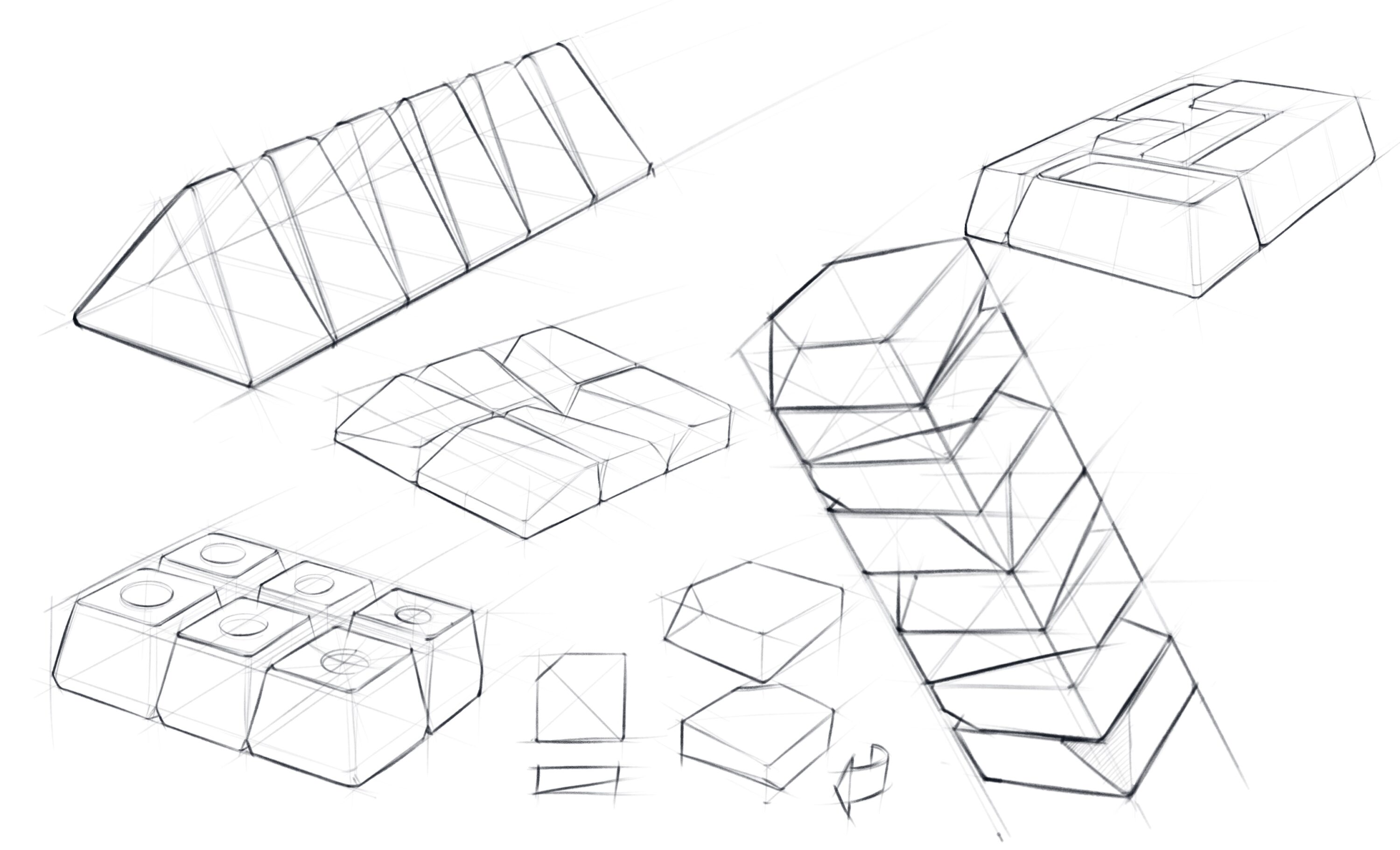
Practice 1_ Generative + Similarity / Gestalt
Design elements that appear similar in some way — sharing the same aesthetic characteristics, color, shape, or size — are perceived as related, while elements that appear dissimilar are perceived as belonging to separate groups.

Process

Define a repetitive pattern, Create simple geometric shape as a module/unit, Apply similarity principle to visual design by sculpting the shape, rotating or modifying other variables.
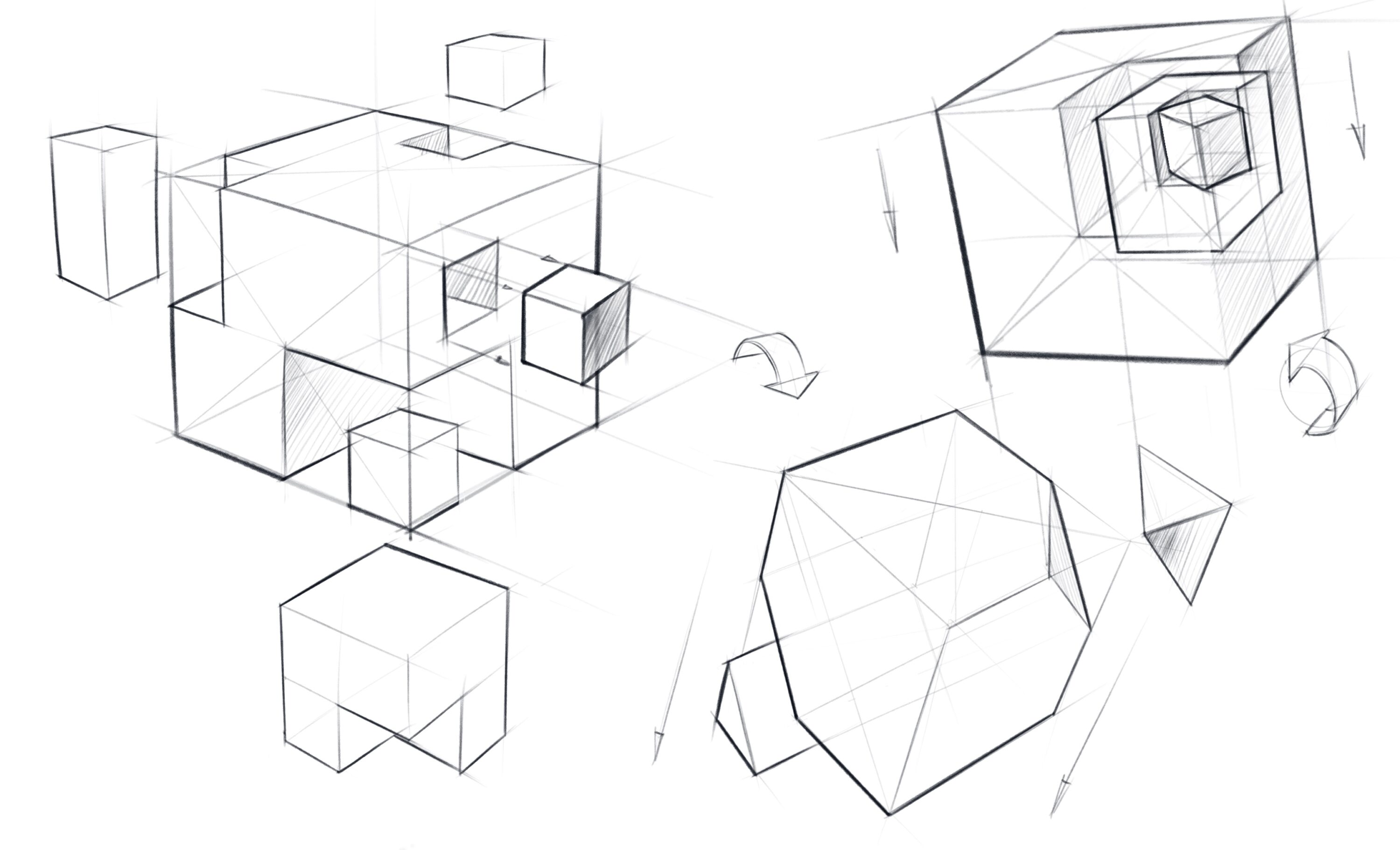
Practice 2_ Subtraction + Gestalt

Gestalt theory is based on the idea that the human brain will attempt to simplify and organize complex images or designs that consist of many elements, by subconsciously arranging the parts into an organized system that creates a whole. There are six individual principles commonly associated with gestalt theory: similarity, continuation, closure, proximity, figure/ground, and symmetry & order.

Process

Have boxes explode out of a box. Use primitive shapes to create visual balance among Volumes, Planar and Linear forms, study spatial relationship among all the elements. Gradually add new levels of complexity to an exploded box.
Practice 3_ Contrast + Additive and Subtractive Process
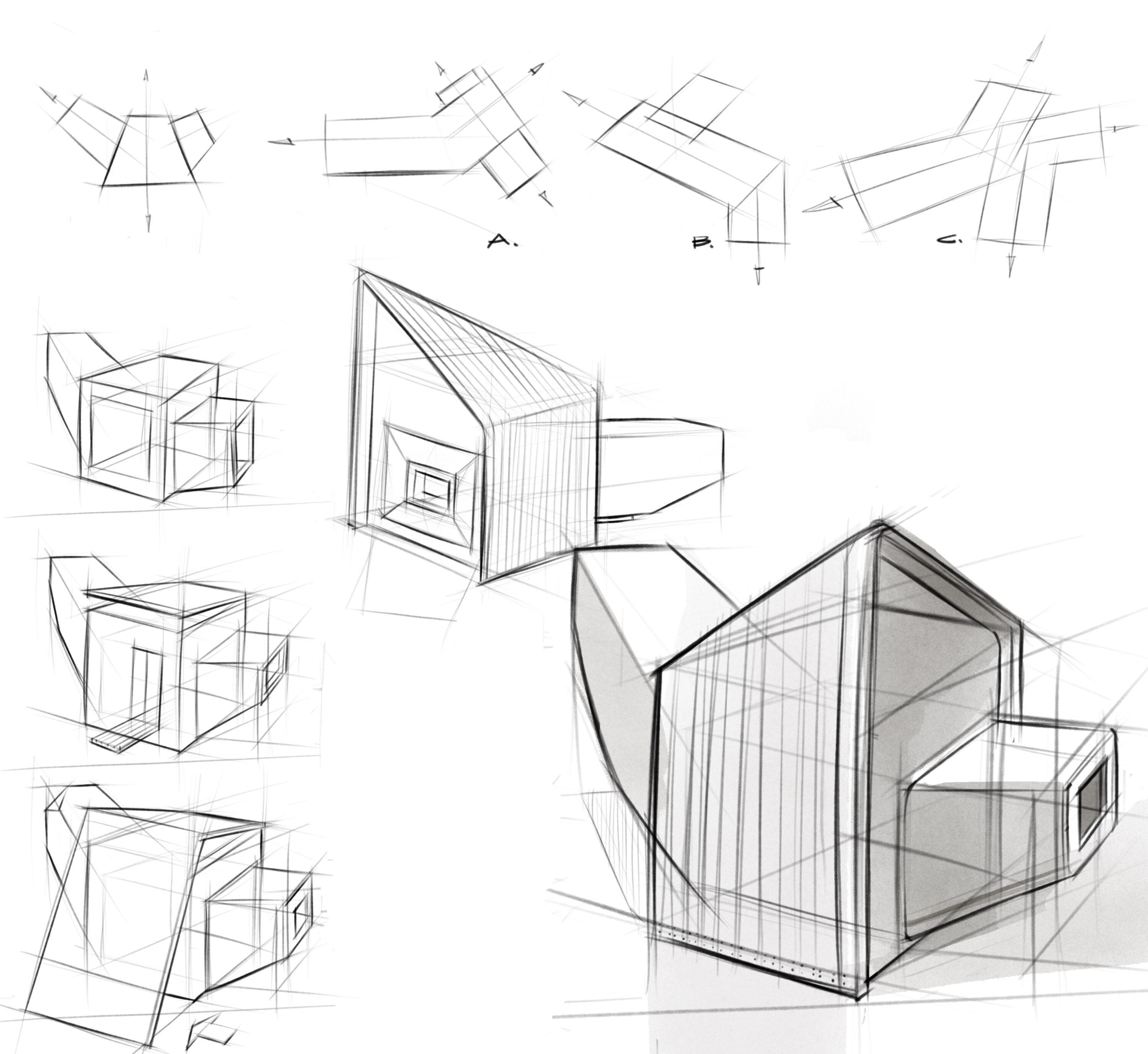
A building footprint is a perimeter of the building plan. Each building plan comprises two volumes that intersect in such a way, which will create a contrast of the orientation and volume between the main building and its adjacent areas. The building above the ground level is undefined. This practice is designed for illustration purposes, establishing the context of storytelling, and it is NOT an architectural design project.

Process

Choose one of the building footprints (A,B or C), use additive and subtractive processes to create a modern commercial building, maintain a similar volume for each concept. Develop at least four different concepts, highlight your favorite design, and use axonometric drawing to construct from different angles.
Practice 4_ Page composition + Solid-Void space
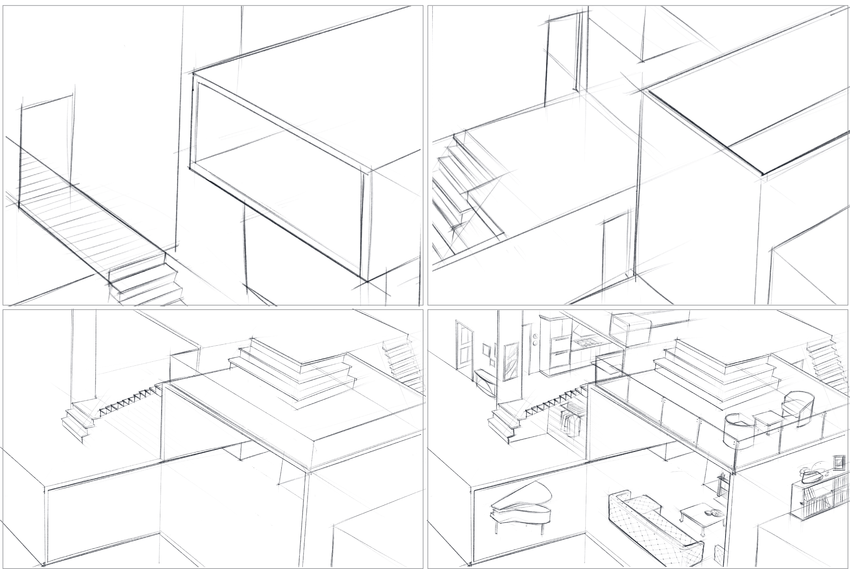
Solid is a matter of presence, and Void is the absence of it. By convention, in a habitable space, airy living space is perceived as ‘Void’ and closed concrete blocks mark the “solid” private spaces. This practice is designed for illustration purposes, and it is NOT an interior design project. To counterbalance the dynamic interplays of form and space, and manage the page composition of this interior space are two main concerns for this assignment. However, it would still be helpful to have the basic needs of human beings or aliens in mind, which will make your design more convincing.

Process

This practice is a reverse version of subtraction and addition. Solid is perceived to be heavier in mass. Voids are scooped out and formed by the enveloping surface. It is negative space in visual design, and like a pause in music, speech, writing, which is significantly powerful to play a counterbalancing role.
Apply the same principle of visual design in an airy space, evaluate the balance of solid and void while ideating.
1. Make at least Eight ideation sketches of the interior space to establish a deliberate design process, evaluate
2. Use isometric to make a furnished space