Visual literacy
It is the ability to understand, interpret, evaluate, and create visual content.
Understand what visual elements (like line, shape, color, form, proportion) communicate.
Decode how visual choices affect perception, emotion, and meaning.
Critically evaluate visuals (“Why does this layout feel balanced?” or “Does it communicate tension or elegance.?”)
Communicate Without Words
Communication requires language. That language can be oral as in the spoken word, it can be gestural as in sign language, or it can be visual as in design.
It is about Optical Illusions and Visual Perception.
Surrounding elements influence how users perceive individual items in terms of size, length, color, and spatial relationships.
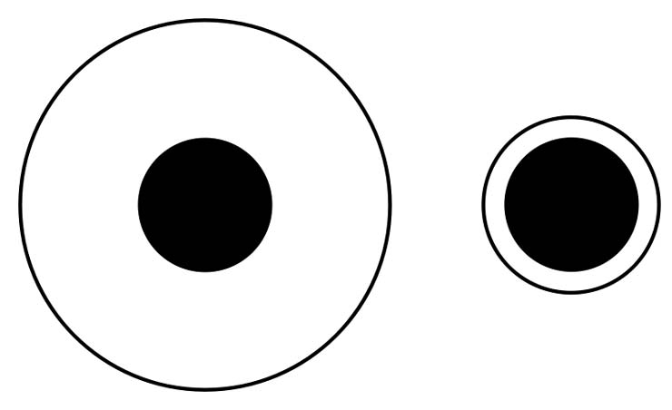
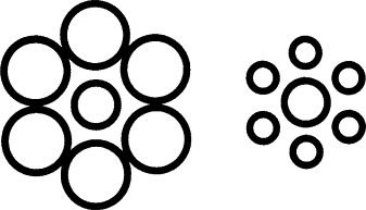
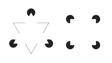
Visual Language Has Its Logic.
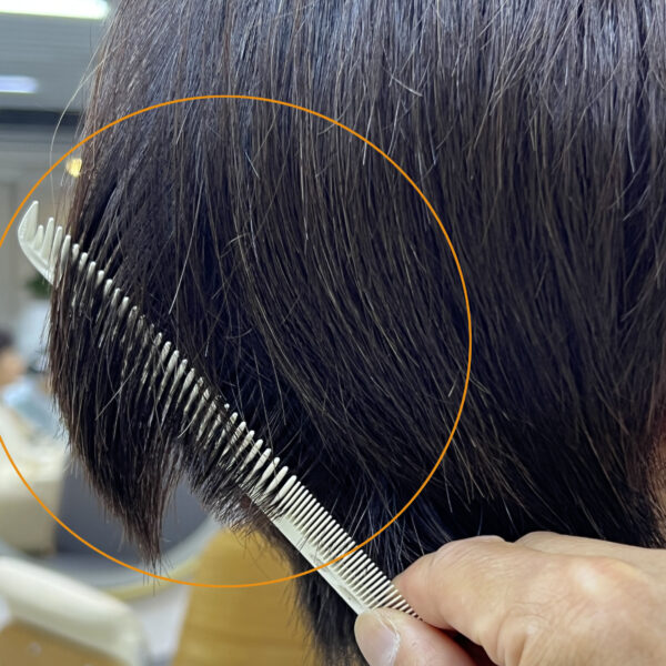
To find effective solutions to problems, my hairstylist carefully cuts my hair at a slant so that when it falls naturally, it curves in beautifully. This compensates for the shape of the skull, and ensures the style. He explains how he made choices to make it easy to maintain and lasts longer until the next cut. This thoughtful approach mirrors the principles of design in any field—using creativity and logic to achieve a good solutions.
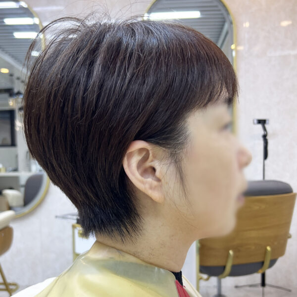

Design involves the deliberate application of psychological and cognitive principles to influence how users perceive and emotionally respond to visual elements, as well as ensuring usability and viability. By understanding these principles, designers can apply a set of logical rules and strategies to arrange visual components, achieving specific effects or effectively communicating ideas.
Elements - Structures - Relations
Elements
The basic elements we have to work with. It Can be abstract or concrete. A product usually includes several basic elements to deliver different functions and experiences.
Elements
Abstract elements include Points, Lines, Surfaces, Volumes,
Point
A point is the fundamental building block of all visual communication elements and principles.
It can stand alone, be identified solely by its own presence, or become an integrated element of a larger collective whole.
Line
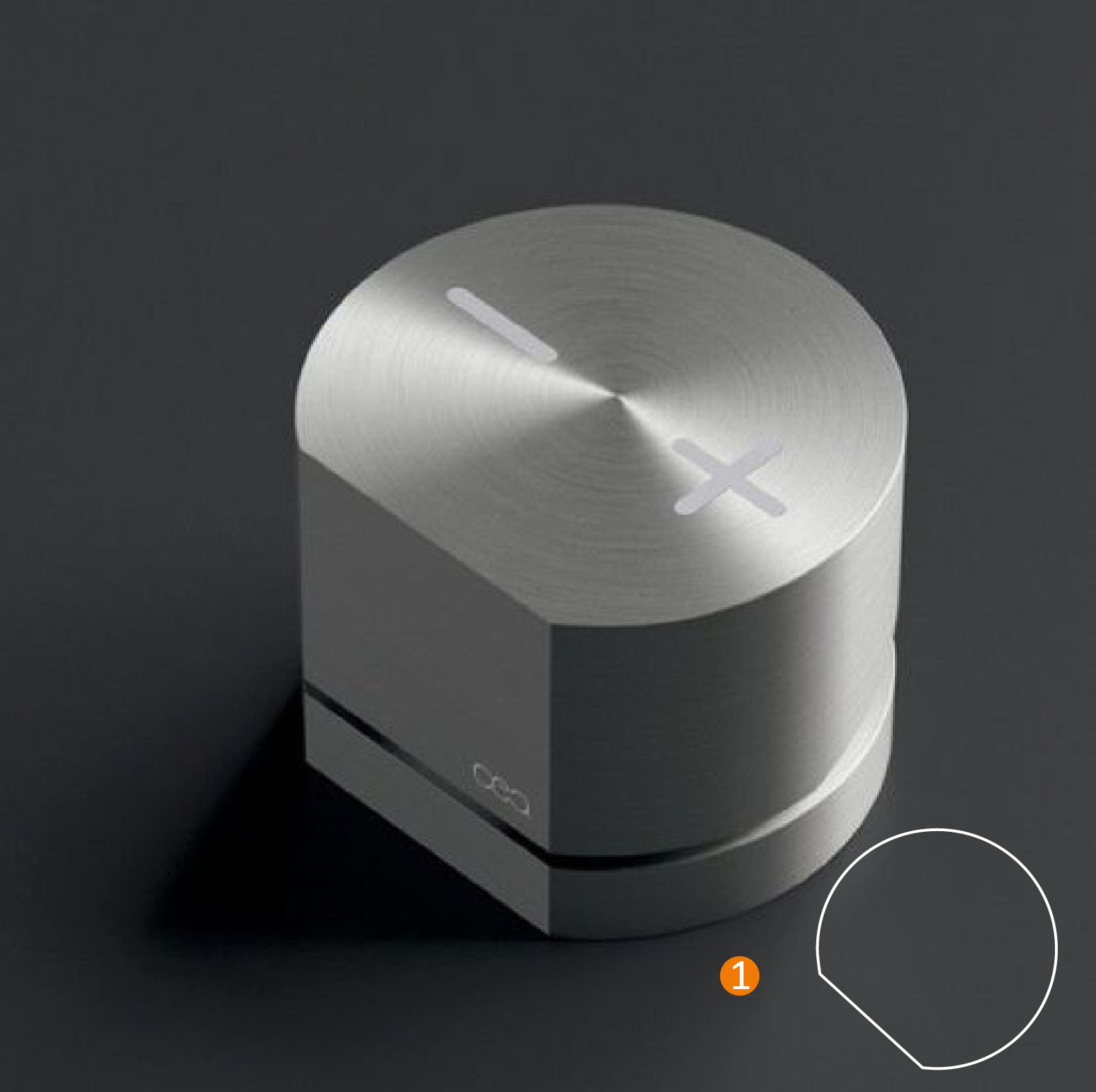
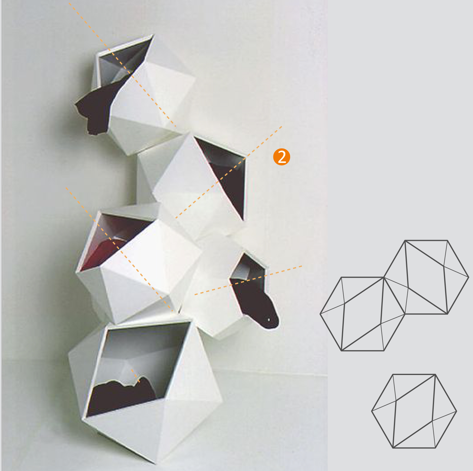
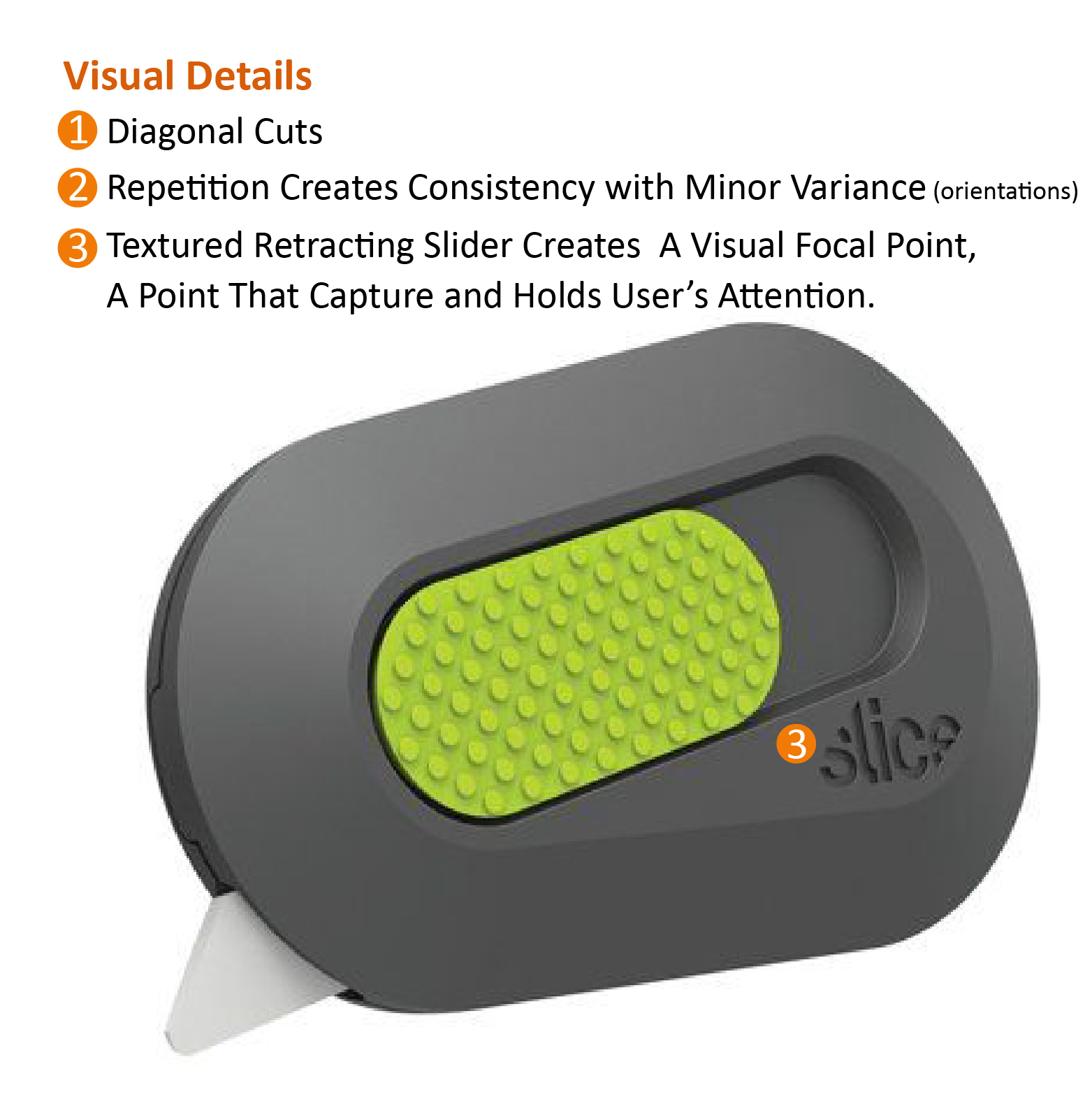
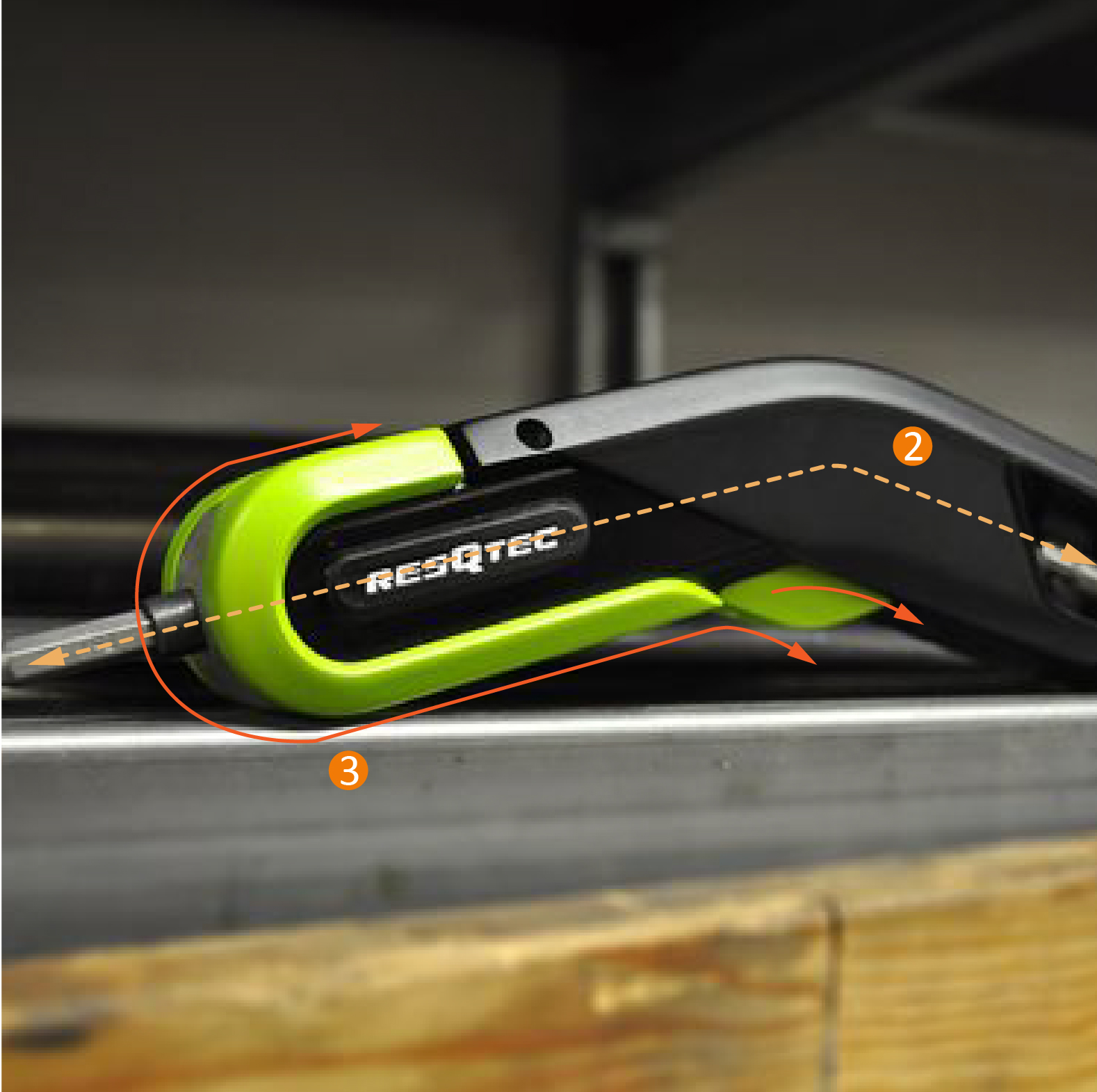
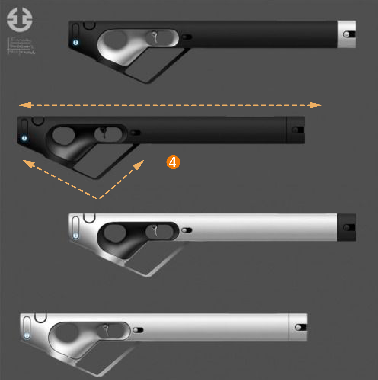
A line can join, organize, divide, direct, construct, and move other graphic objects. A line can be read as a positive mark, a negative gap or a mating line. Lines can be actual or implied. A line can lead the viewer’s eye movement and provide areas of interest. When use properly, a line can improve readability,
Surface
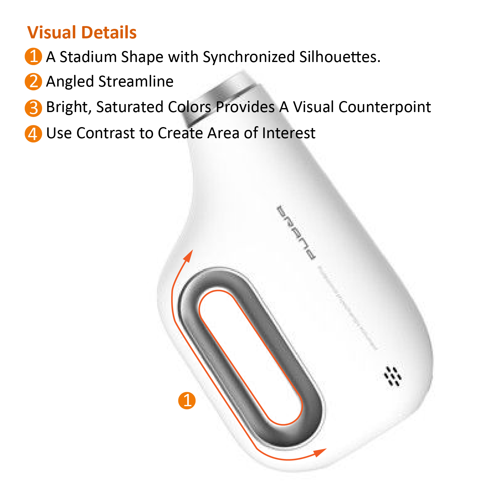
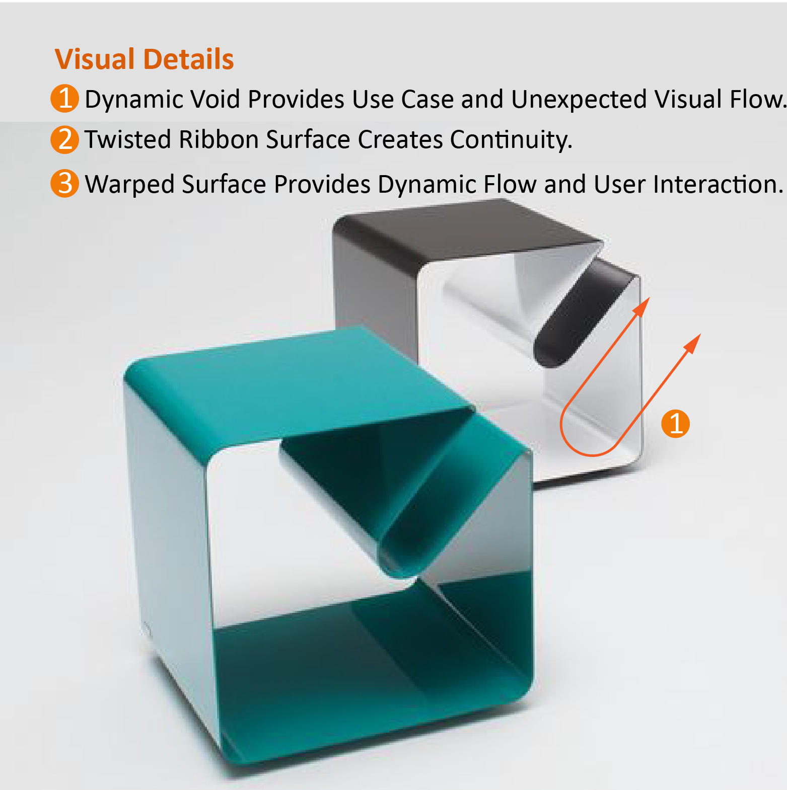
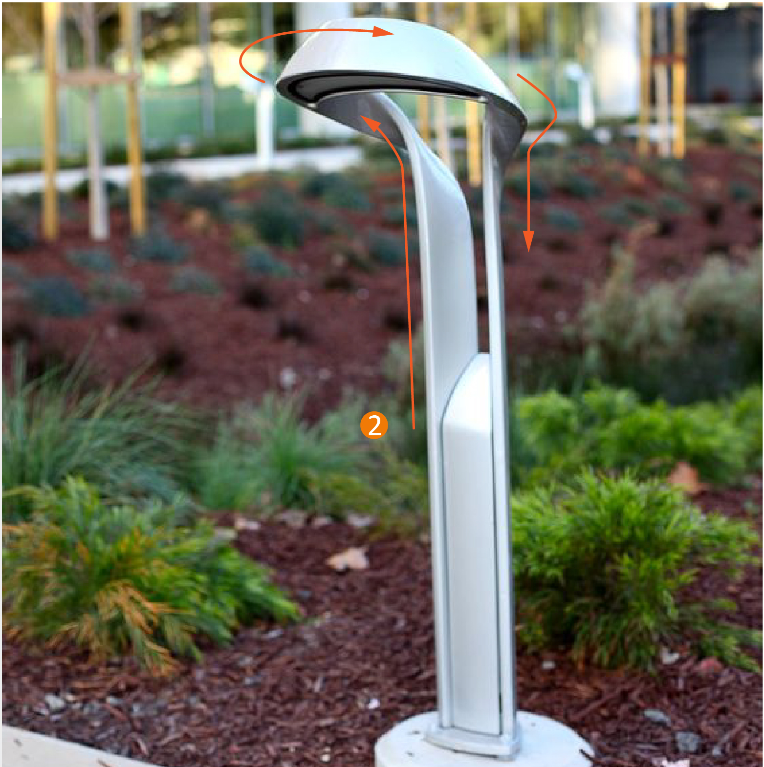
A surface could be a two-dimensional plane that appears to be flat or curved that is defined by contour lines.
It’s common that there're different types of elements used at a time, which provides a strong visual counterpoint. A surface could be seen as a line and a dot becomes a shape when it dominates the visual language.
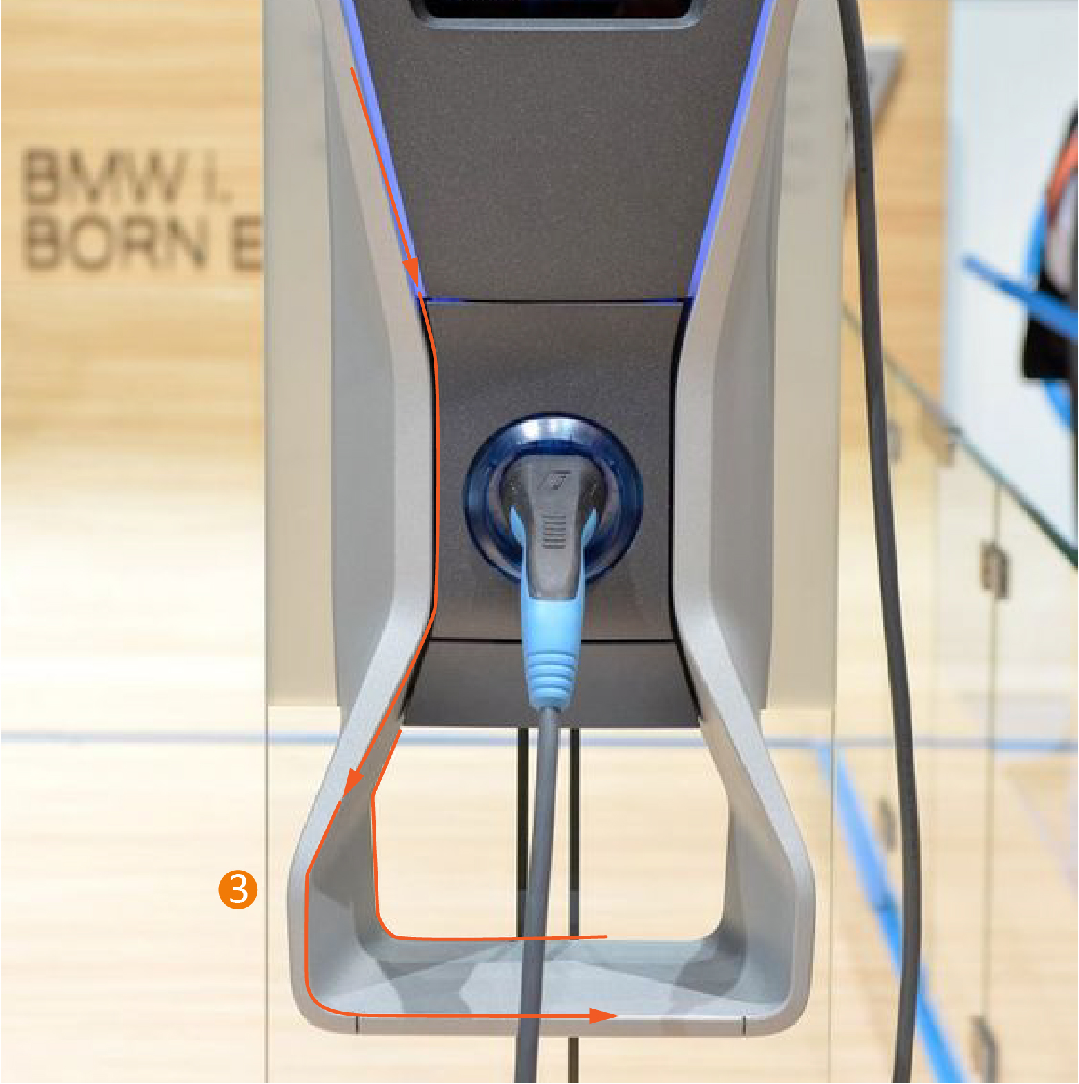
Volume
A mass is defined by other elements-surfaces, lines, and points. It has height, width, and depth. The enclosed volume holds internal components, such as a motor, PVB board, and batteries.
In compositional terms, a point and line function as a figurative element in or on a surface, mass, and background. This is a fundamental principle of figure-ground and visual balance in a visual composition.
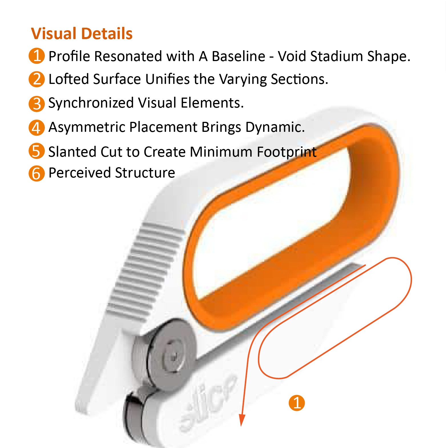
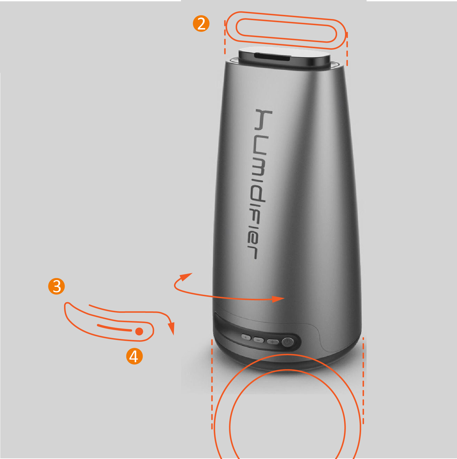
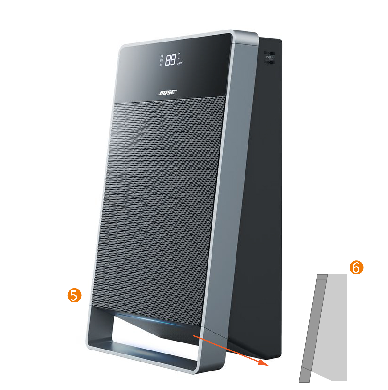
Geometric Form
Most of the products are geometric in character- spheres, boxes, cylinders, prisms, cones, and pyramids. They are based on mathematical formulas relating to the point, line, and plane. Geometric shapes are consistent, crisp, and mathematically precise.
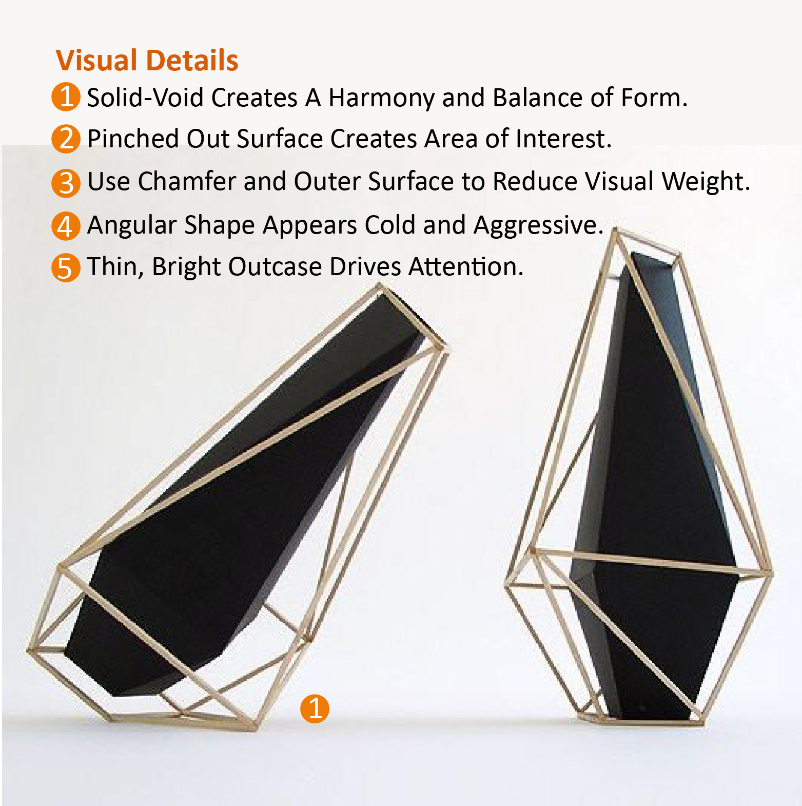

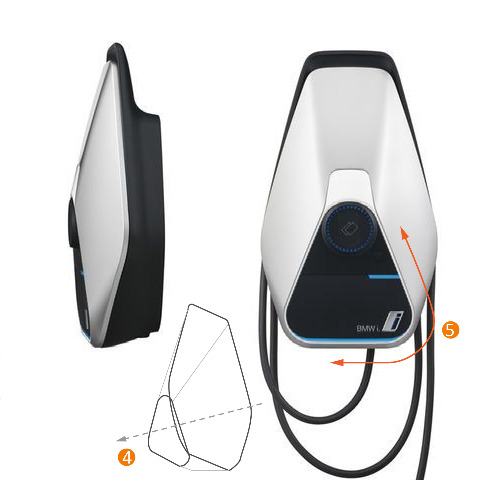
It's always fascinating how forms hold their power in making people think, feel, and act a certain way. A form can communicate Contrast, Tension, Balance, Emphasis, Movement, White Space, Proportion, Hierarchy, Repetition, Rhythm, Pattern, Unity, and Variety. These principles of design work together. Even with primitive shapes, it could still create something that is aesthetically pleasing and optimizes the user experience.
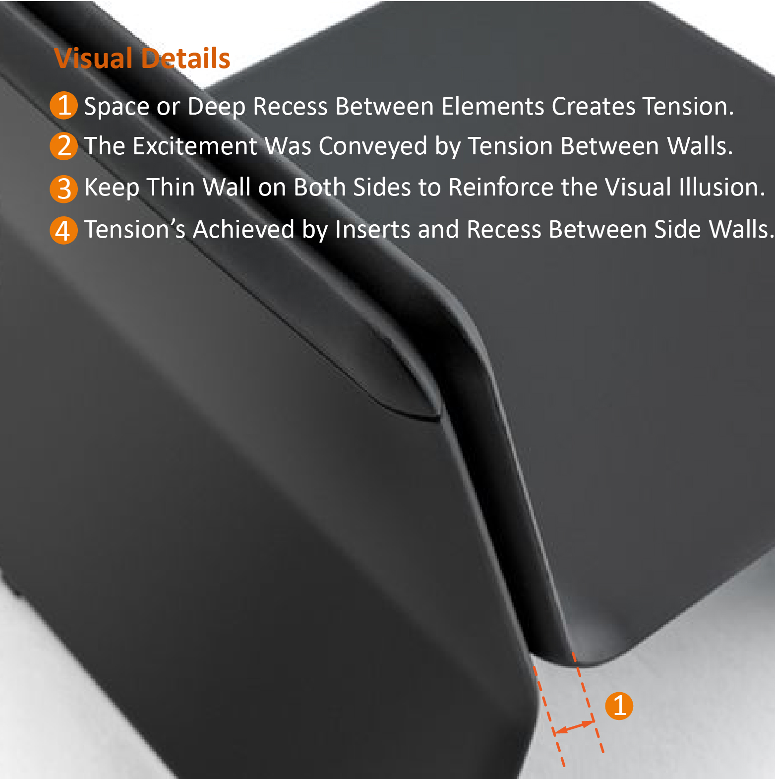
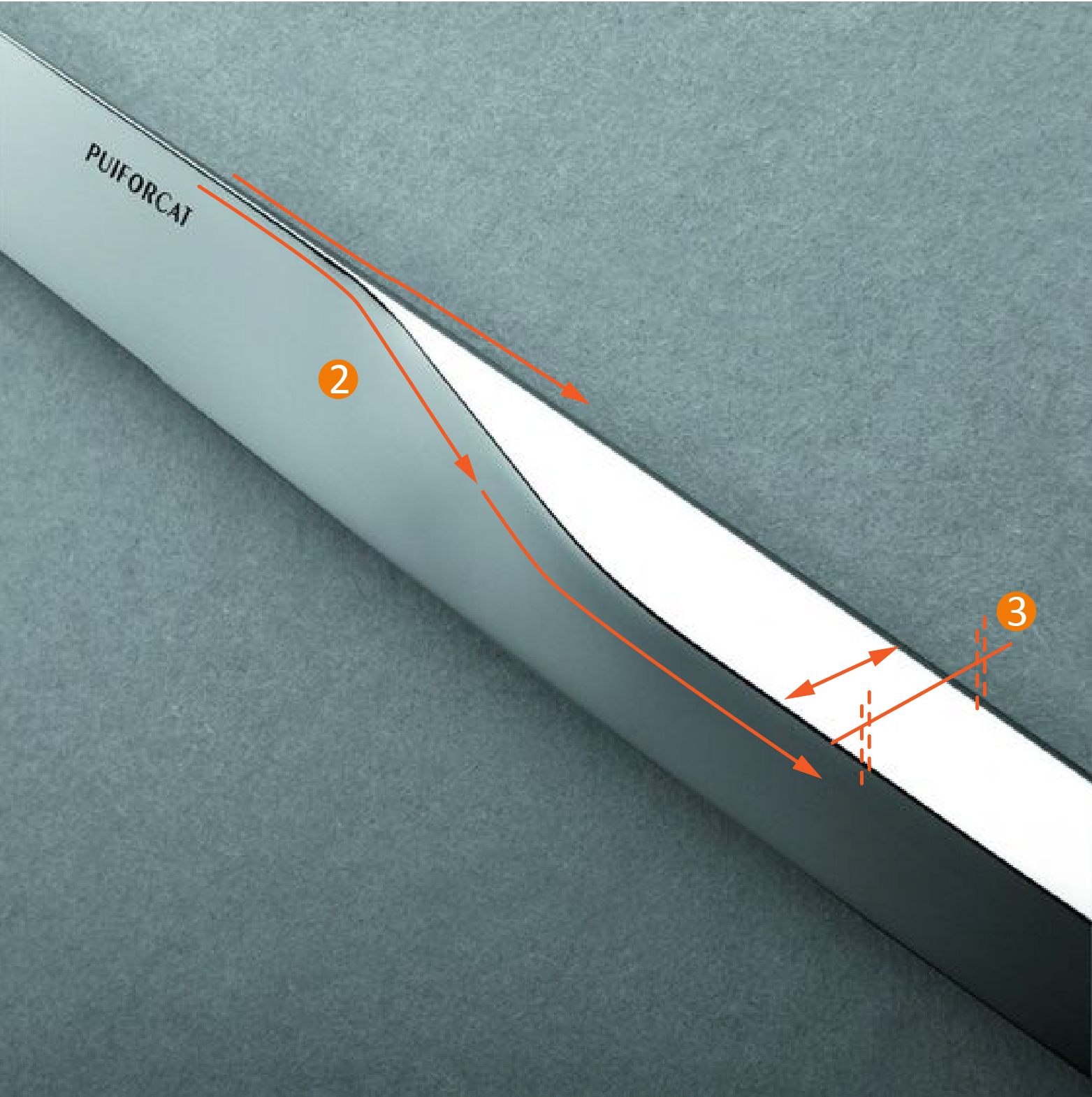
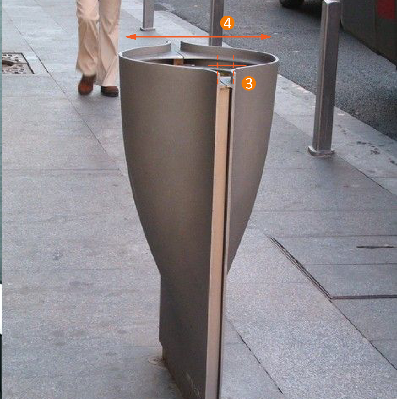
Organic Form
Forms that are created or derived from nature and living organisms are organic. It is usually irregular and soft. It could still work with geometric forms to find a balance in a visual composition.
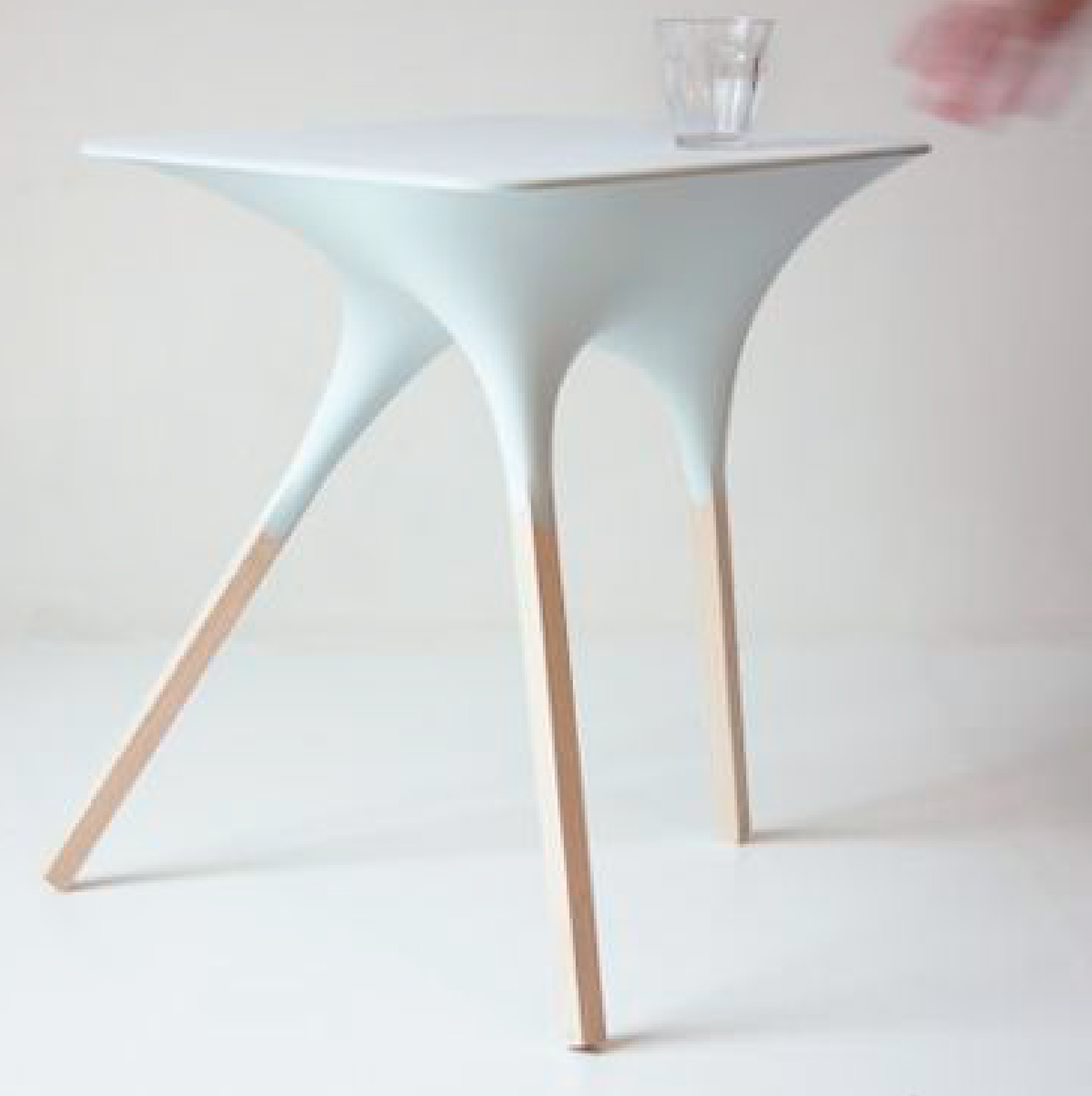

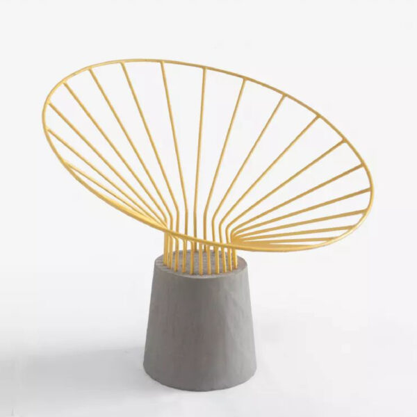
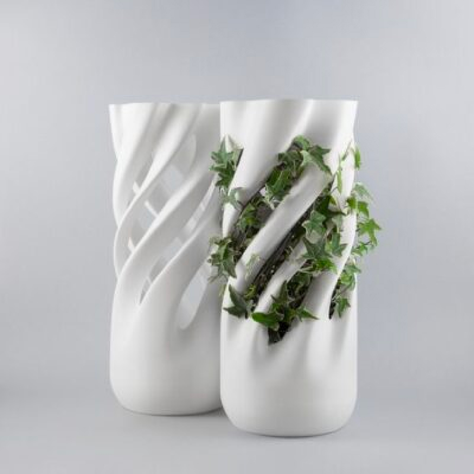
The 3D printing industry and parametric design study will bring more possibilities.

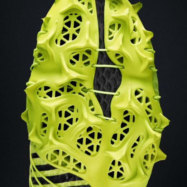
Structures
Structures will be formed whenever there are two or more components in relation to one another.
Structures can be hidden or visible and they may be active or inactive.
Visible Structures
Functional Exposure reveals hidden technology.
Visible structures indicate how the components are organized. Users can see the influence of each part.
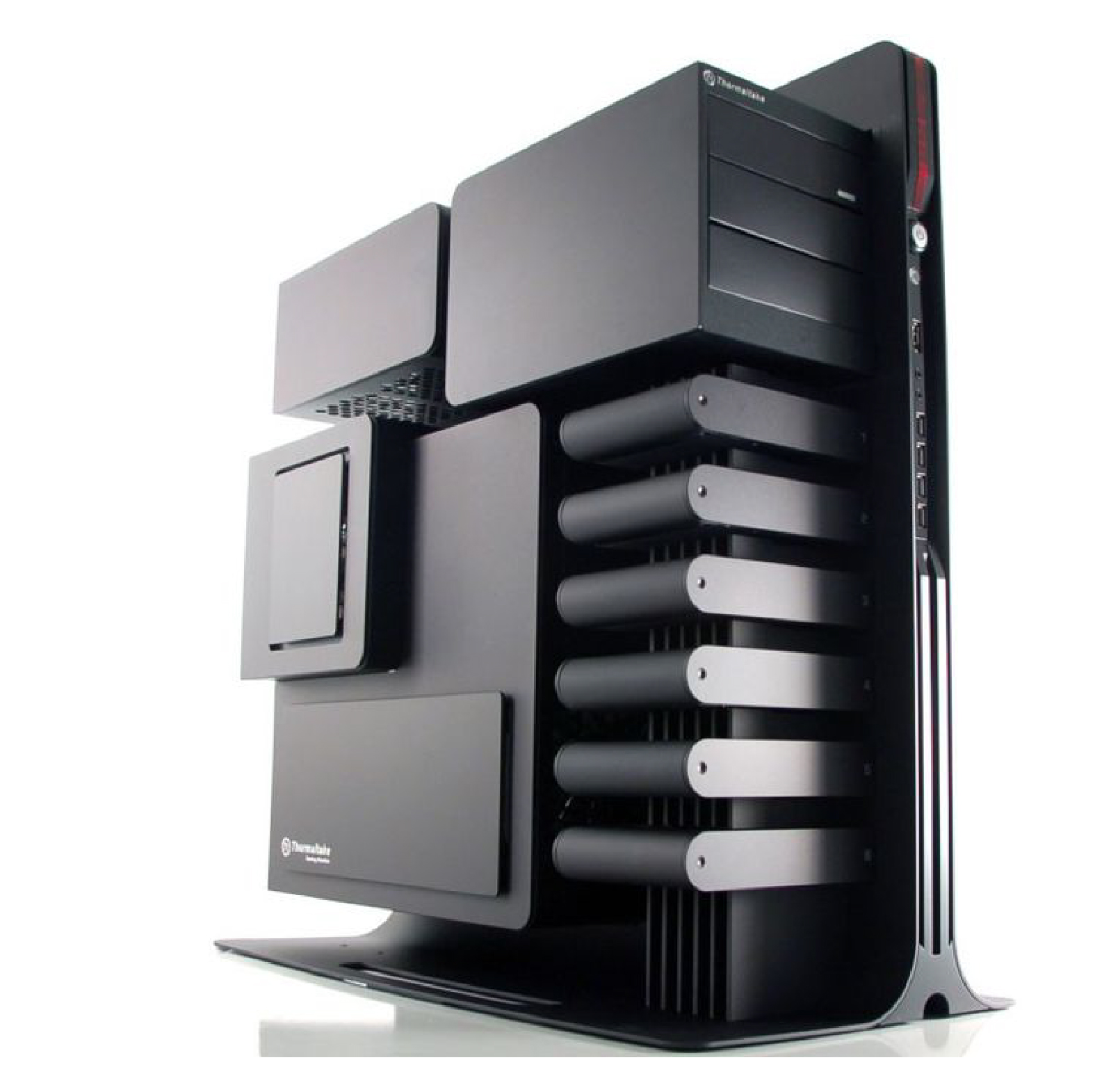


Visible and Active
Furniture design often make the structures visible. These details were visualized how parts were assembled together, how parts were piercing through or what was the joints look like.
The concept design of the Coffee machine on the right visualizes the realtime coffee making experience while keeping the structure integrity visible as well.
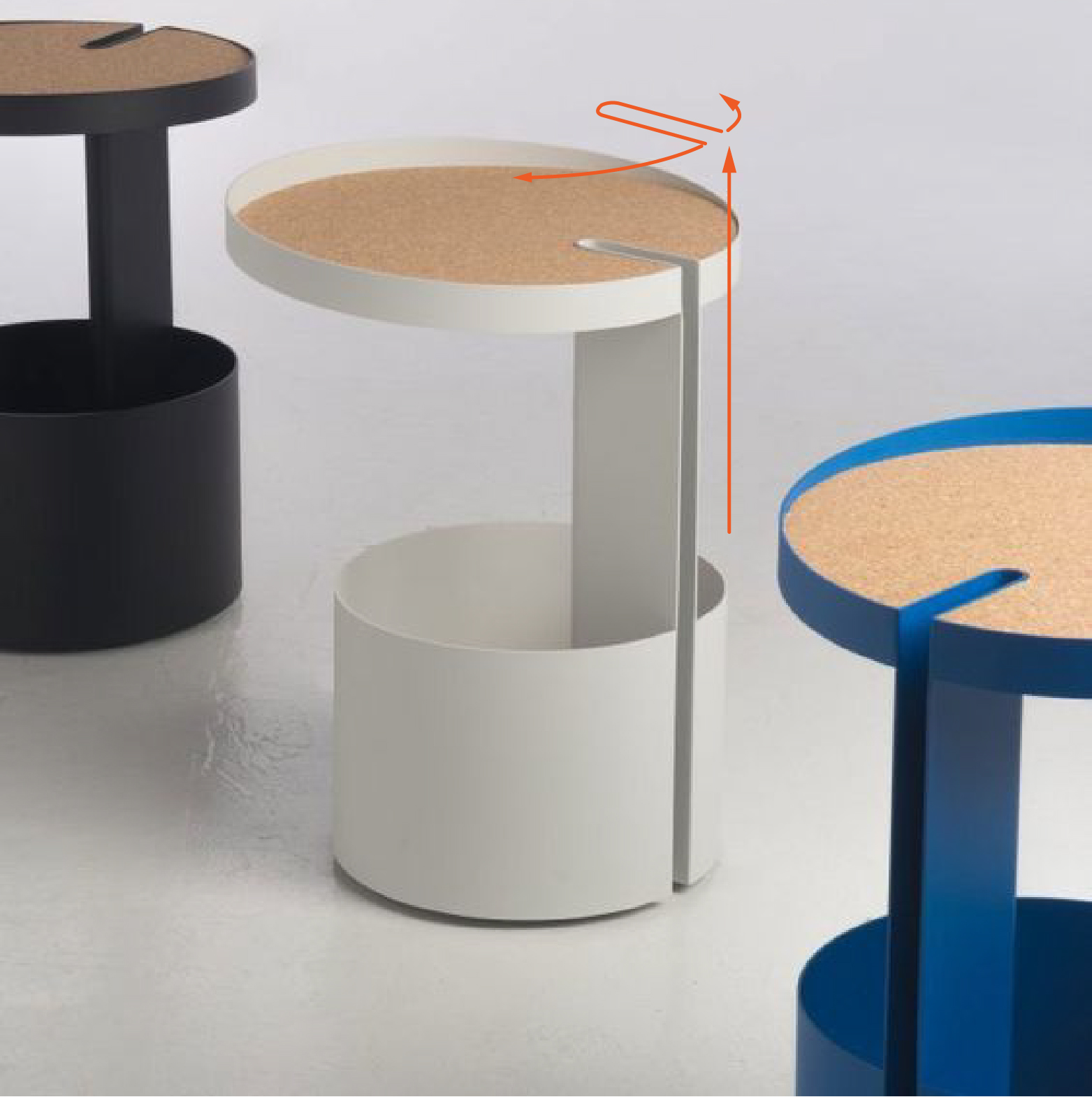


Invisible and Active
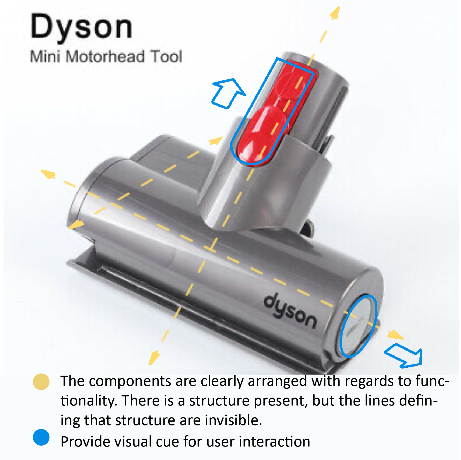
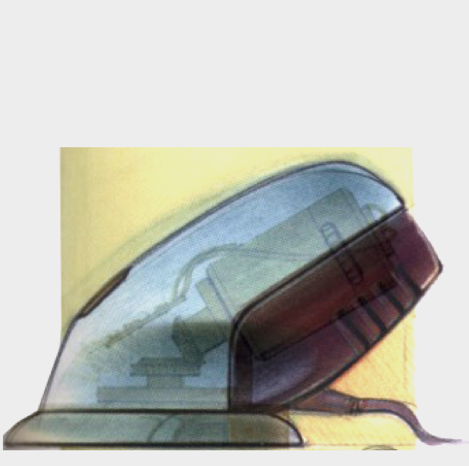
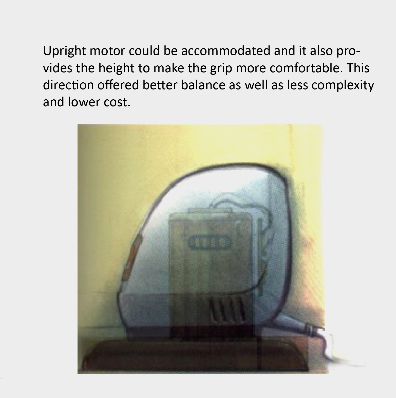
The mouse sander by Black & Decker's, the structure lines are invisible, but it is still active. That influences the form of the structure and user experience in many ways.
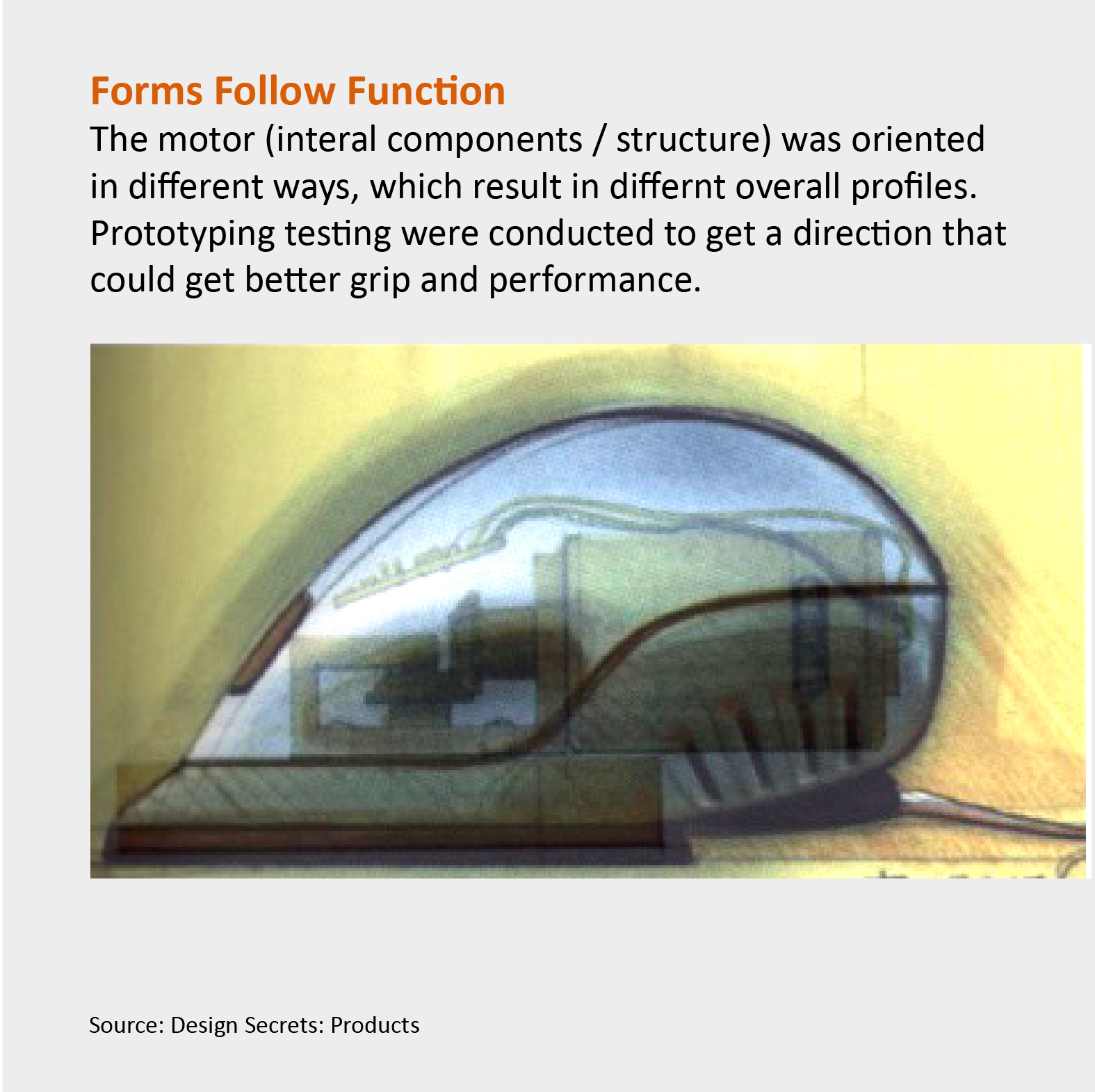
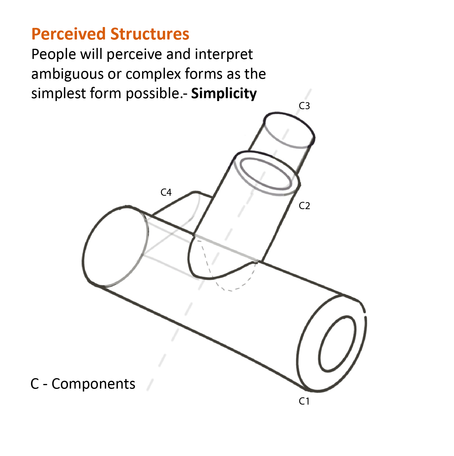
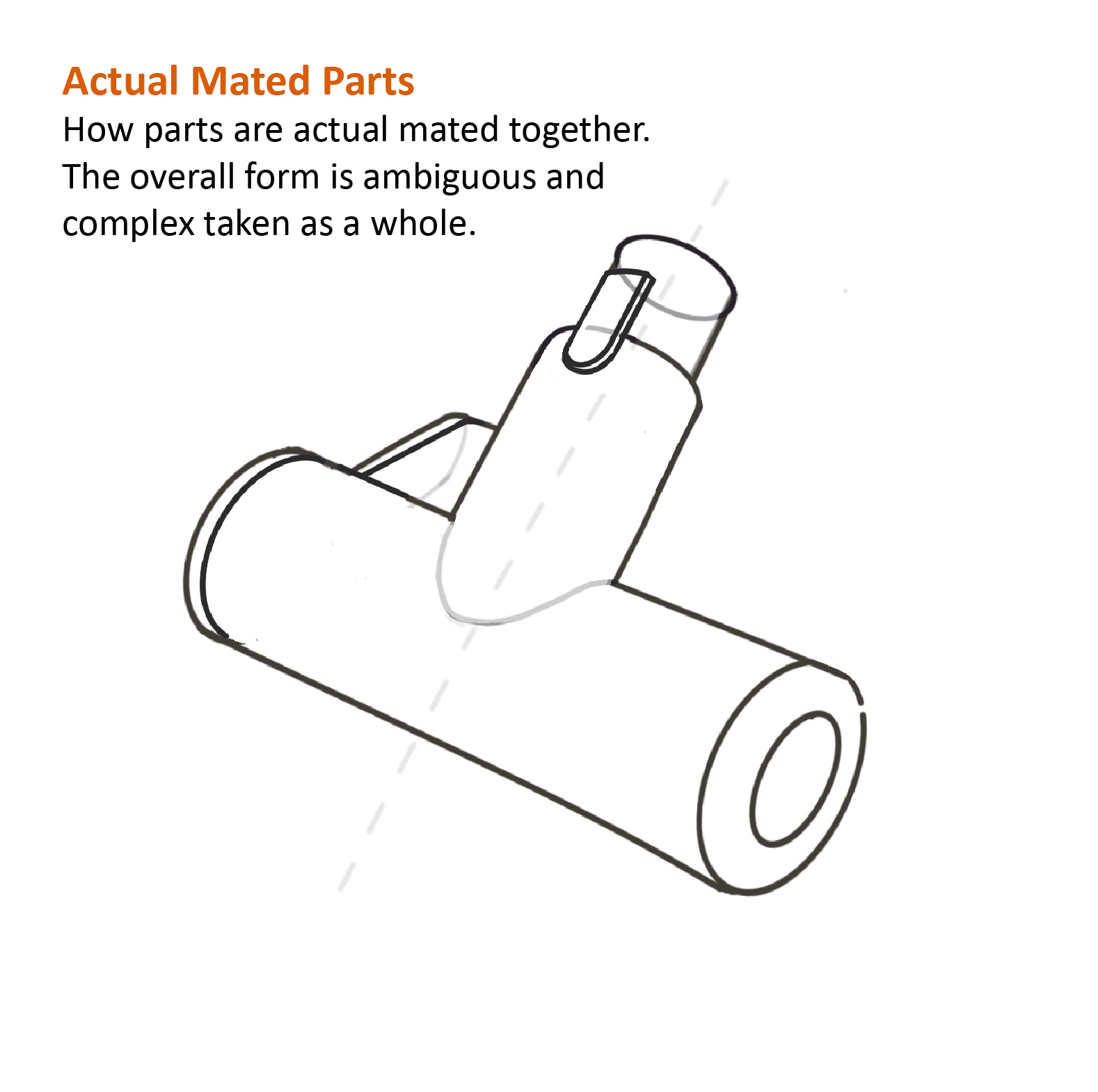
Perceived Structures
In most of the cases, the internal components were hidden and inactive.
The tectonic perception was created to establish some visual interest, either perceived closure or continuation, inserting, interlocking or wrapping. It guides the viewer's attention and provides clarity and readability.
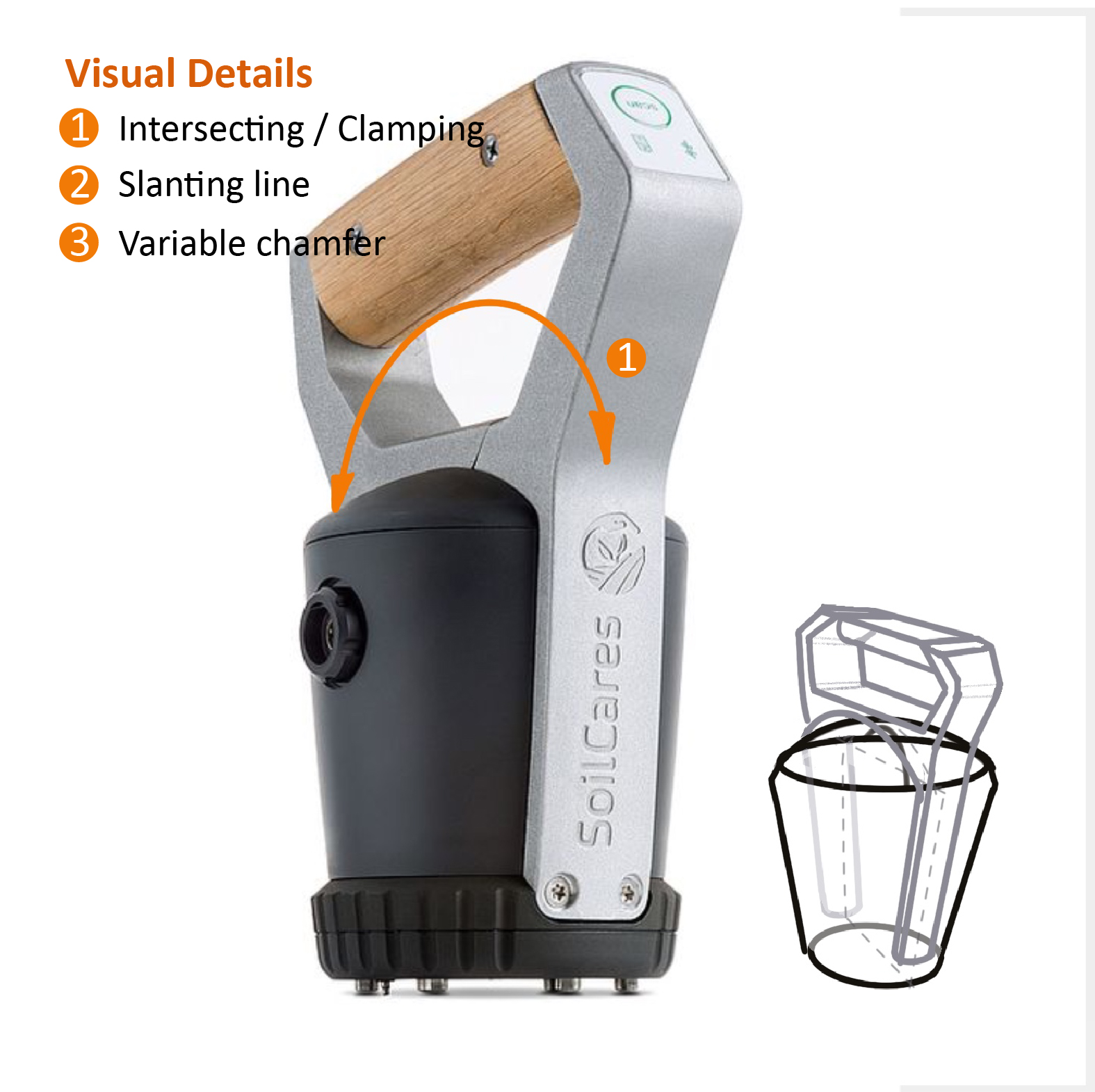
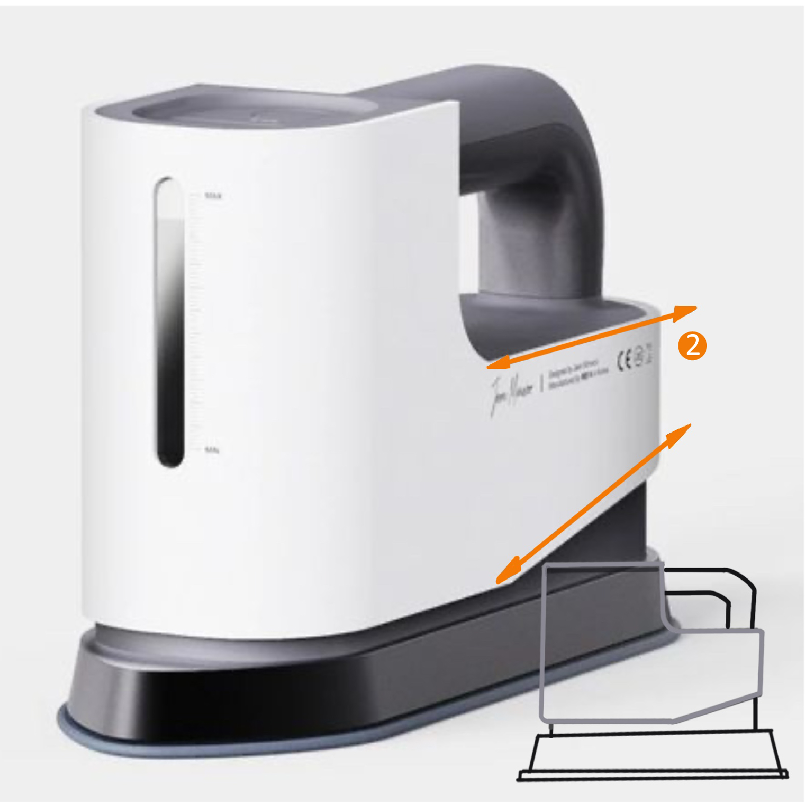

When a product involves several elements or user interfaces, the Law of Unity was often applied to create a visual connection among the elements. It is how the brain processes visual stimuli.
It is also perceived structure. Visible structures indicated how the objects are organized, but they don’t have to be the actual internal layout. The grid or some iconic language establishes an order, or a visual statement, or creates a distraction for a complex system.
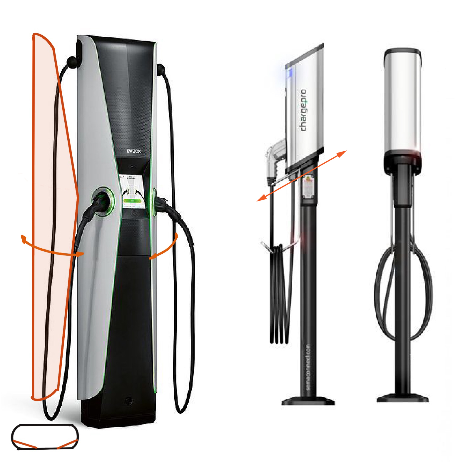
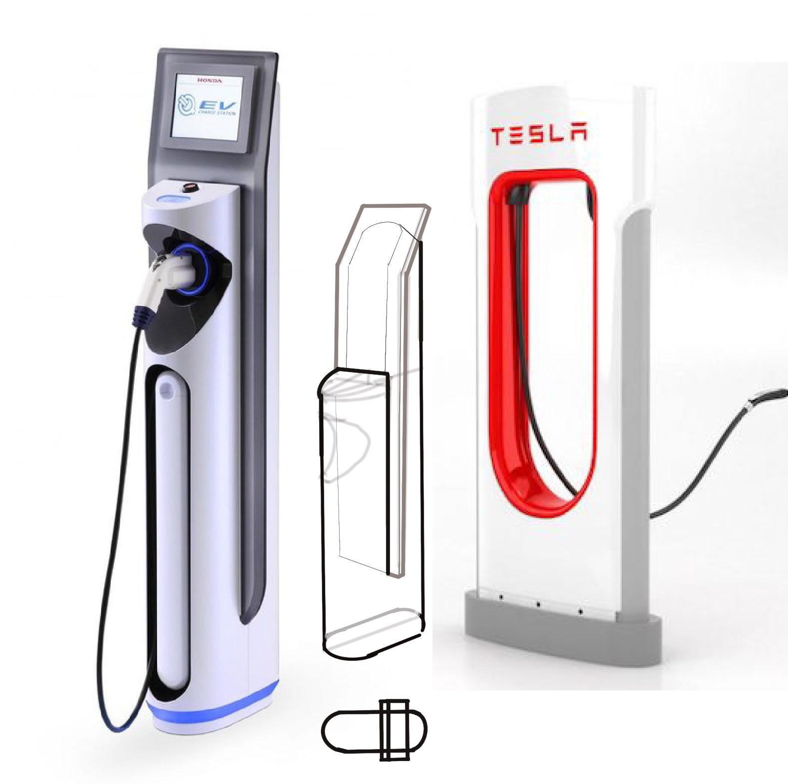
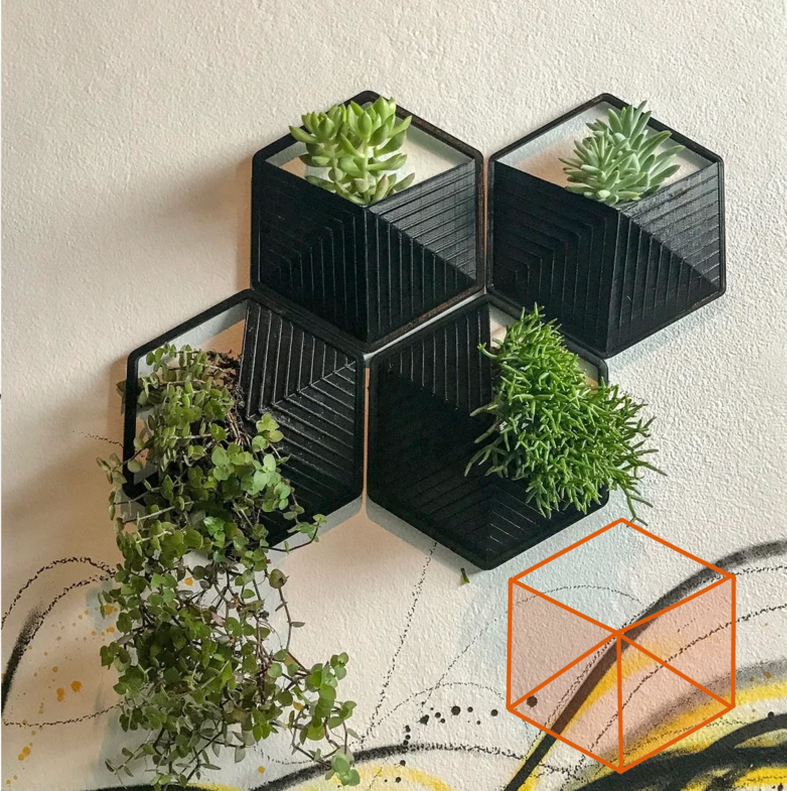
Law of Simplicity - People will perceive and interpret ambiguous or complex forms as the simplest form possible.
Pure geometry illustrates a timeless relationship between parts.
